
MyPwr App Navigation
Navigation upgrades to an Empowerment Self Defense App
What is MyPwr App?
MyPwr App is a social tech startup that teaches Empowerment Self Defense and other violence prevention techniques through a research-based curriculum.
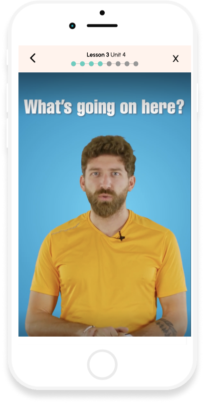
The app delivers lessons using a diverse range of formats, including audio, video, text, animation, and gaming elements.
B2B & B2C Target Market
B2C - Women's Version
B2B - CAGE Version (College All Gender Version)
PROBLEMS
User testing uncovered patterns in user needs.
Users...
...lack clarity of "where they are" and "what they are doing"
...want to understand their progress
...need to be able to pause and/or leave at any time
...be able to move back and forth between units freely
...review instructions if necessary (room for error)
SOLUTIONS
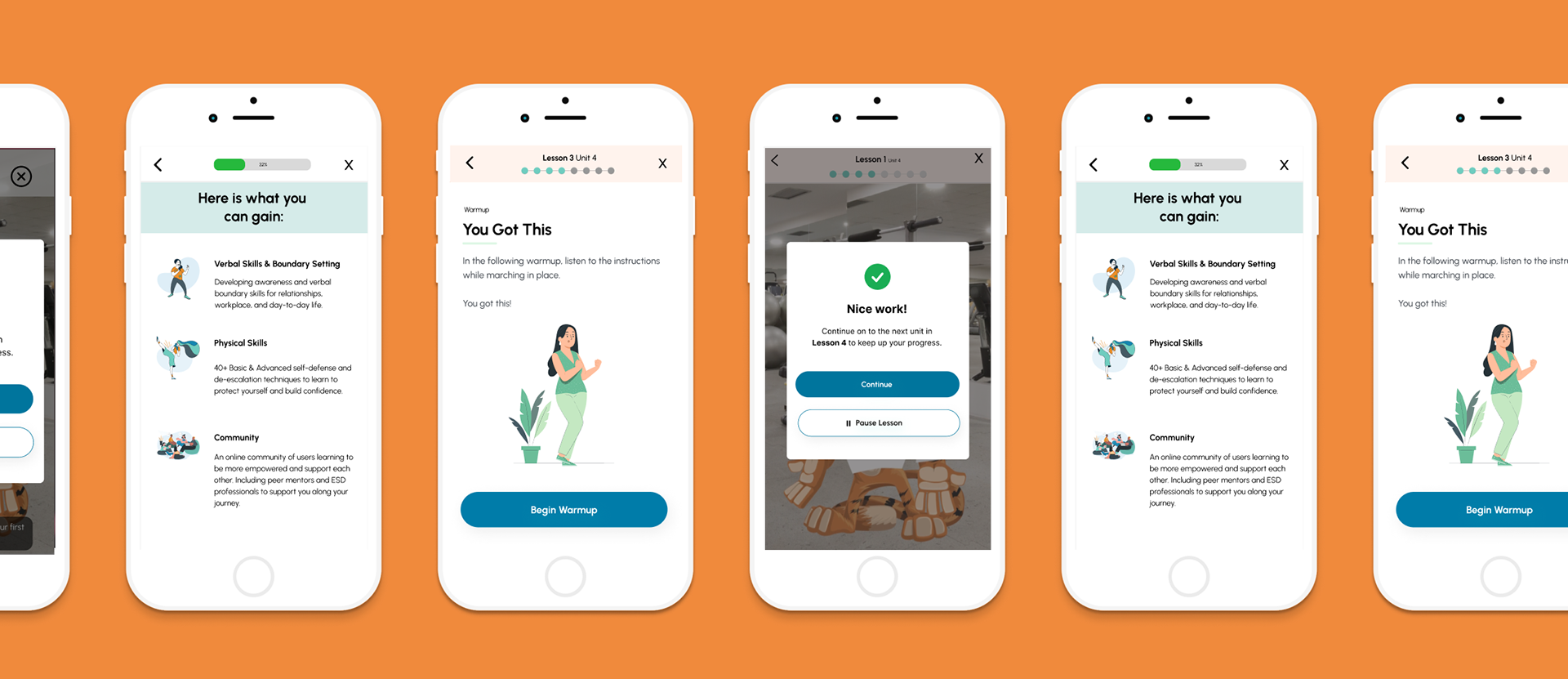
Enhanced Navigation Experience, including:
*App Bar With Progress Tracking
*Clear Exit Option
*Lesson Navigation Controls
*Clear Division of Micro-units
Project
Navigation upgrades to the user experience through lessons within the app.
Team: 11
2 Designers
3 Developers
2 Content Writers
1 Video Producer
1 Project Manager
1 Product Manager
1 COO
Tools
Figma
Figjam
Chat GBT
Survey Monkey
My Roles/Deliverables
Lead UX/UI Design, Research, & Writing
Design System
Information Architecture
Interaction Design
User Testing
Wireframing
RoadMapping
My Design Process:
Empathize ⇒ Strategize ⇒ Design ⇒ Test ⇒ Ship

Research Goals & Defining KPIs
Two highlights-
1. Understand the most common patterns in the average user frustration with the current navigation.
2. Determine feasible solutions to address user needs.
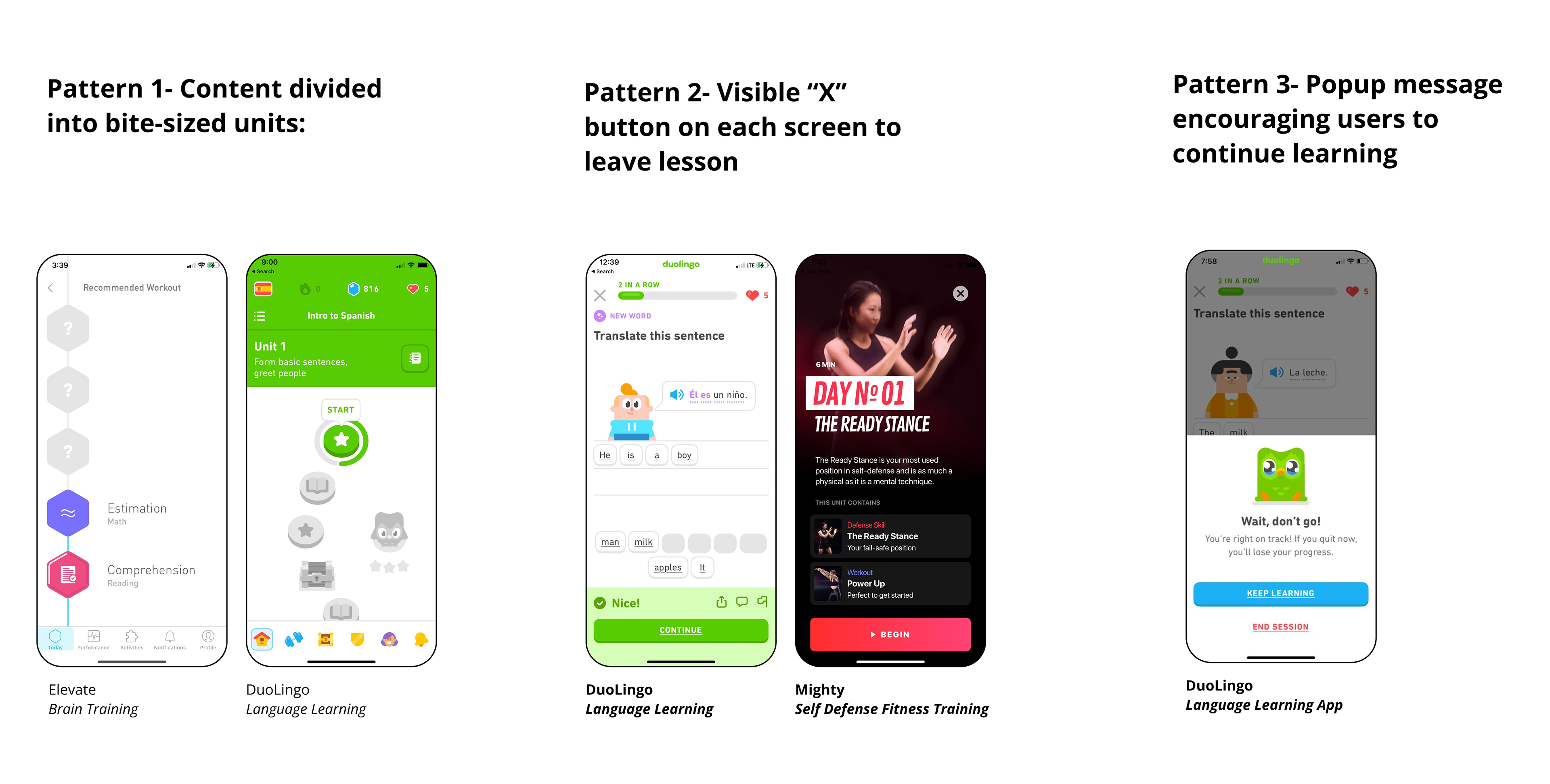
A competitive analysis uncovered lesson navigation trends across fitness, meditation, and brain training apps.
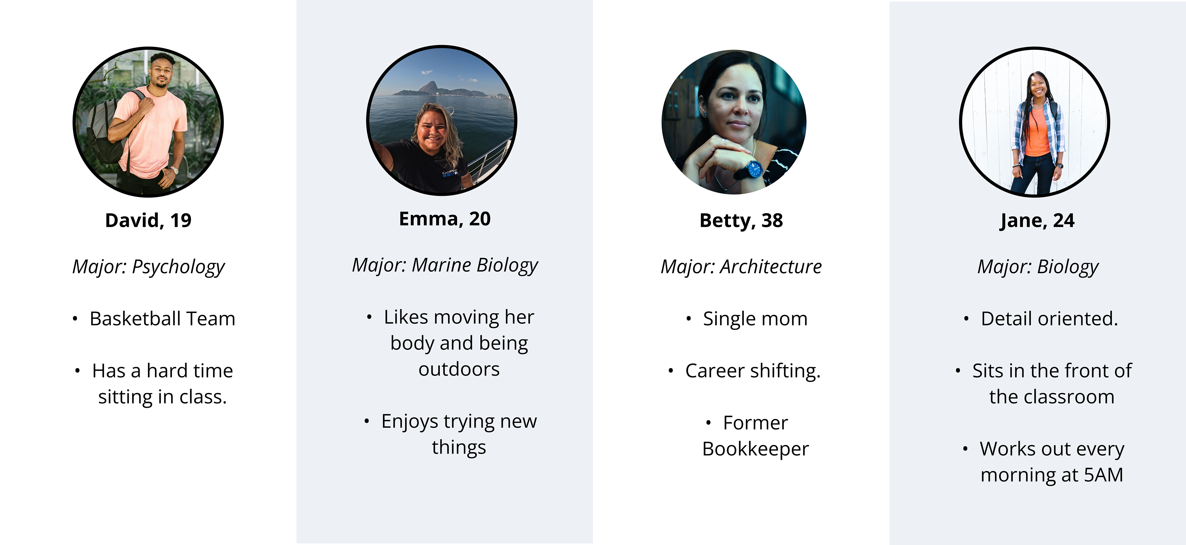
User Persona Personalities
In focusing on the college version of the app, I created user persona personalities.
Throughout my design process, I turned back to these users to ensure their varying needs were met.
Some highlighted users and personality traits:

I evaluated the existing navigation, highlighting successes and pain points.
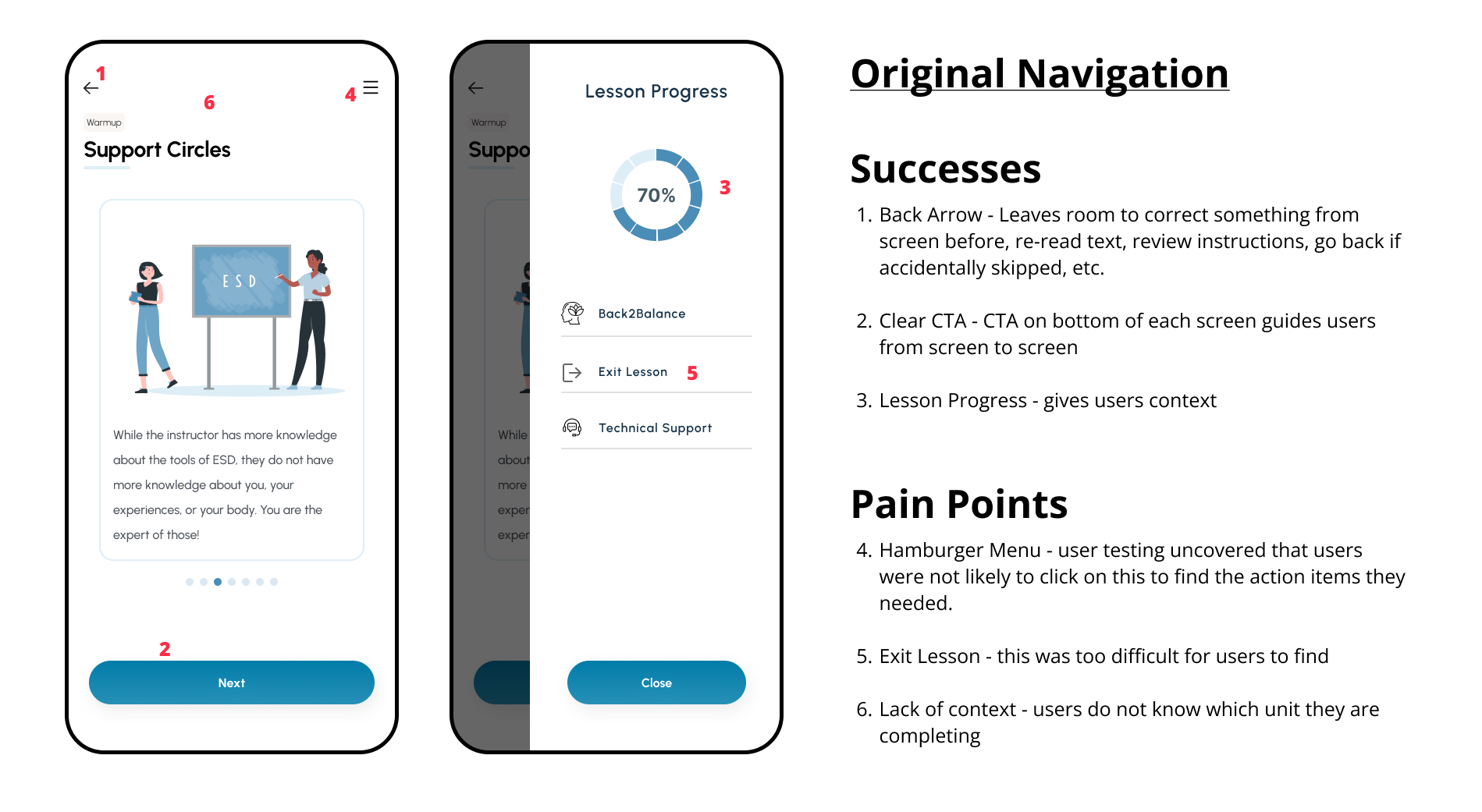
Compiling insights from the research, I understood user needs.
For instance, app learners prefer to:
1. Understand progress within a lesson
2. Feel freedom to exit at any point
3. Know where they are - lesson and unit
...all without working too hard. 🏝️
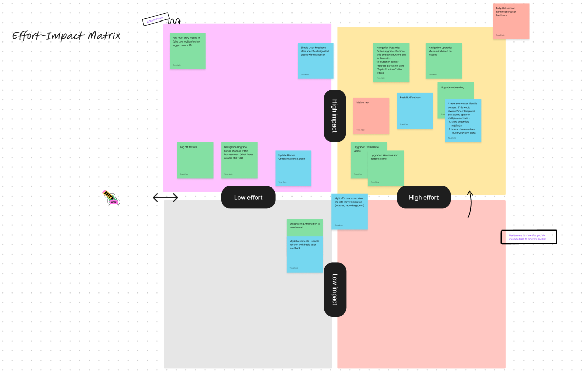
Next, using an Impact-Effort Matrix, we created a list of new features and prioritized.
Highlighted new features:
1. App Bar With Progress Tracking on each screen of the lesson
2. Clear Exit Option ("x" button on each screen), with message
3. Lesson Navigation Controls: Back and forward arrows, skip button, clear CTA on bottom
4. Division and Display of Micro-units
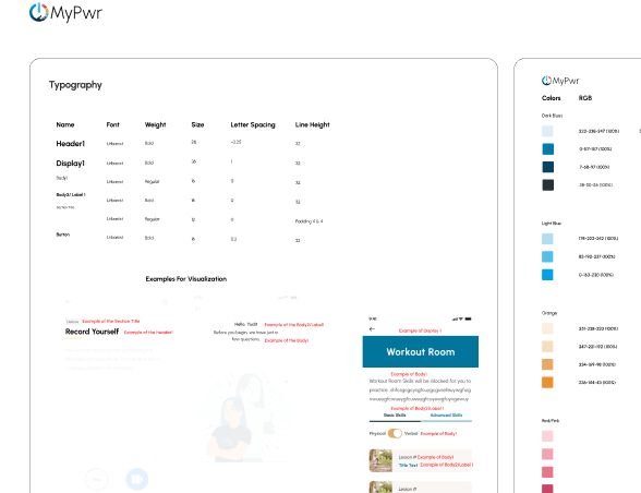
*Note - quality of this photo is intentionally poor to protect the privacy of the company.

**I've placed Design & Test together to reflect the tight deadlines and time constraints of the project. Due to circumstances, designing, testing, and iterating happened in an agile process.
Task and user flows helped determine placement and prioritization of the new features.
...and then some quick sketches to explore!
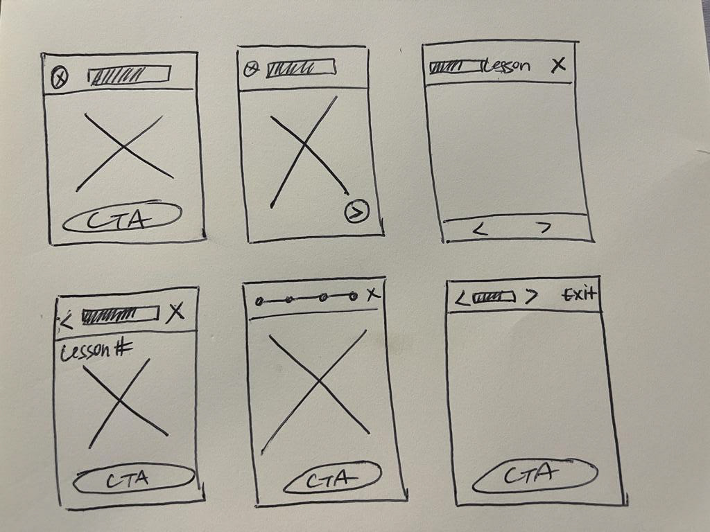
Next, I created lo-fidelity frames...tested (via userbrain.com)...iterated...
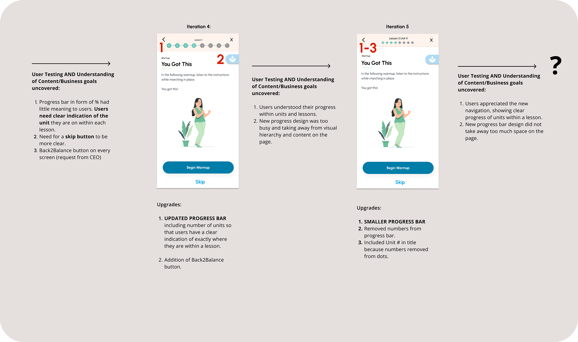
Featured Iterations-
A) App Bar Navigation Controls Upgrades
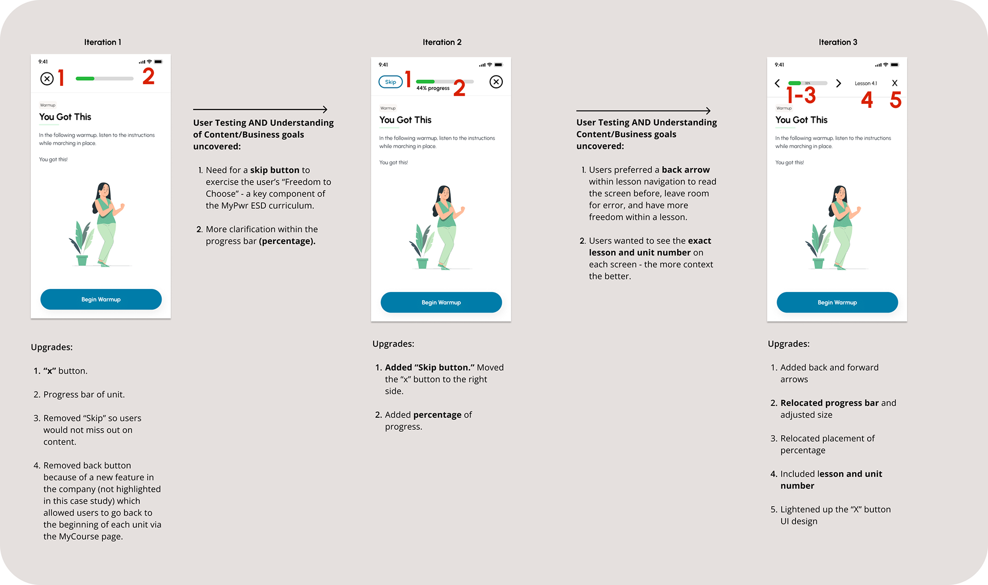
B) Exit Lesson Popup
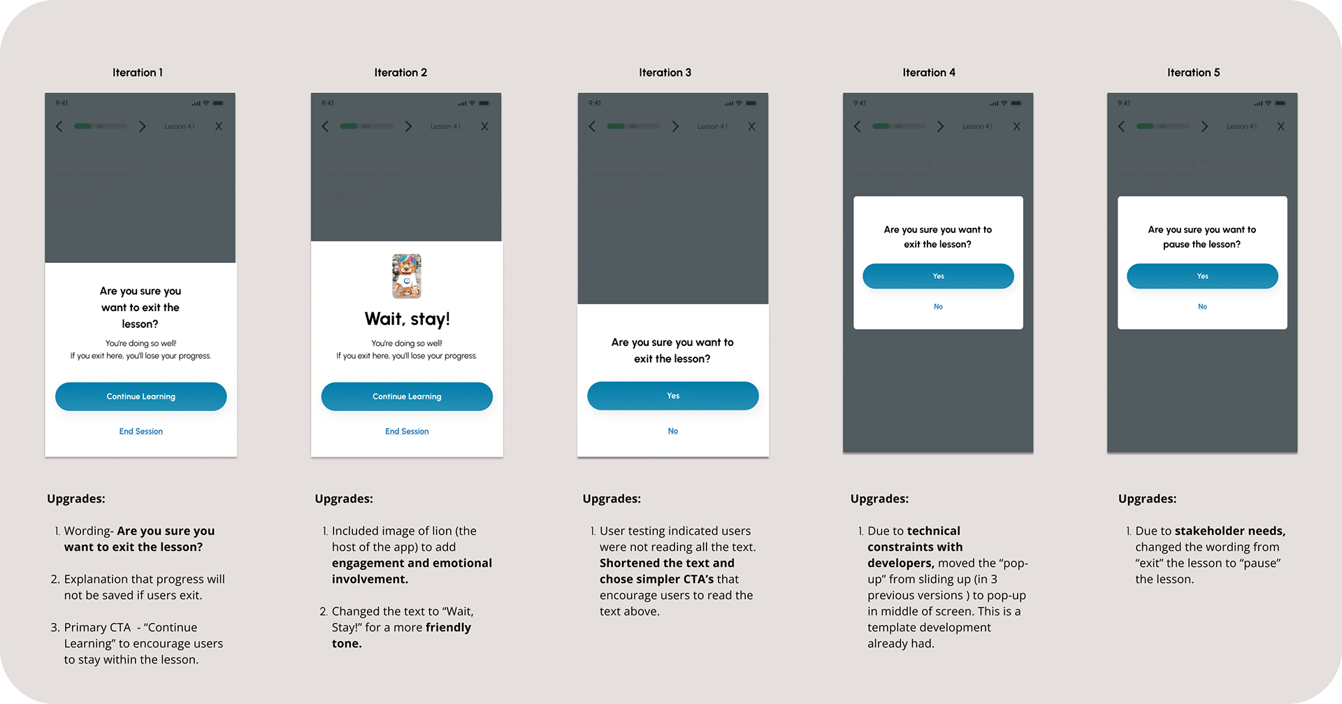
The pop-up message above appears after a user clicks "x" when they are mid-lesson.
MyPwr's pre-existing design system informed colors, typography, button sizes, etc.
*Snapshot is cut off to protect privacy of the company

I collaborated with an 🙌 AWESOME 🙌 development team on the daily.
Goals of our meetings:
1. Discuss technical feasibility and functionality of new designs
2. Hand-off design assets
3. Review timeline and sprints
4. Prioritize new features
5. Plan iterations
Moving forward...
Some UX goals for MyPwr navigation:
1. Usability Testing, data collection, and iterations:
Conduct further user testing on the upgraded navigation system with college students using userbrain.com. After students have utilized our program, conduct further research and interviews to understand if students feel their needs have been met and where the app can improve.
2. Micro-unit structure upgrades:
The navigation upgrades in MyPwr App are largely based on a new implementation of dividing the lessons into bite size units. Although the lessons have been broken down (a definite upgrade!), user research indicates that users prefer more context before entering a unit (for example, the type of exercise they are about to encounter, the amount of time it will take, etc.). To implement this upgrade, this would require extensive collaboration with the Content team.