Cosmedics by gila
Responsive website redesign for a medical aesthetics spa
Background:
Gila is the medical esthetician behind Cosmedics by gila (yes, with a lower case "g"). She started her business several years ago and has an established client base. Located in Westchester NY, Gila offers a customized approach to skincare. She uses medical-grade equipment for all her treatments.
PROBLEM
Gila's current online presence does not reach a younger age demographic.
Gila's customers should be able to:
*understand Gila's approach to skincare
* access a current list of available services
* book an appointment
SOLUTION
An accessible and modern redesign of Gila's existing brand and website.
A redesign of Gila’s website that includes:
-an accessible and clean redesign that allows users (especially younger ones) to find her services online
-partial rebranding
-connecting and showcasing social media platforms
-updated and accurate information and photos about Gila's services
Project
Responsive Website
Branding
Tools
Figma
Adobe Illustrator
Adobe Photoshop
Wix
Miro
Zoom
Optimal Sort
My Roles/Deliverables
UX Design
UI Design
UX Research
Stakeholder Communication
Information Architecture
Interaction Design
User Testing
Clickable Prototype:
My Design Process:
Empathize ⇒ Strategize ⇒ Design ⇒ Test ⇒ Ship
I created a detailed research plan before beginning the research phase.
My Research Goals:
1. Understand the market trends for the skincare and beauty industry in Gila's area.
2. Identify Gila's target users, and how to best support them.
3. Discover customers' greatest pains and gains surrounding booking skincare/beauty treatments online
4. Offer clear CTAs for both new and existing users
To learn more about my research goals, methodologies, assumptions, participants, and timeline, View Research Plan.
A Competitive Analysis highlighted some interesting patterns:
Top Left: BeautyVille Laser & Aesthetics
Bottom Left: FaceGlow Skincare Services
Right: Heyday Facials and Skincare
Design patterns identified among all 3 competitor sites:
1. Pictures of the salon itself
2. "Contact Us" Section
3. Clear directive to book an appointment
Research confirmed that users find success through clear booking directives.
To discover more, I surveyed 37 women between the ages of 21-72:
With a deeper understanding of user motivations, I created user persona personalities for each target audience member.
I utilized user personalities alongside fundamental design principles to evaluate cosmedicsbygila.com.
Before moving on, I shared a Research Debrief Presentation with Gila.
This ensured transparency with the client and kept communication open.
Next, I organized the understandings I had gathered from my research to shape project goals.
Gila's overarching business goal for this redesign: Broaden target audience by appealing to a younger age demographic.
The key features on my Product RoadMap help Gila focus on the features that will enable her to appeal to a younger age demographic:
Users indicated that their main goal on Gila's site is to book a service. I kept this in mind as I shaped the information architecture.
The user's goal to book a service implies an action that is accessible. I kept this in mind as I ensured that the information architecture supports user needs.
The organization of services on Gila's old site did not support the user's need to book a service.
I took a closer look at the existing information architecture on Gila's site. I uncovered many areas for improvement.
For example:
"MedSpa" from the navigation menu leads to a page that mentions injectables.
"Signature Services" lists several more services under "Med Spa Services".
↑ This is inconsistent.
Next, I conducted a Card Sort to understand the service categories young users are looking to encounter.
Using the results from the sort, I identified patterns to create a second SiteMap. This time, I focused breaking down on the list of services available and their descriptions:
I identified task flows in order to support each user's unique needs.
Each of my provisional personas had varying goals. This helped me understand a variety of user interactions with the content on the site.
Hand drawing initial sketches helped me brainstorm many ideas:
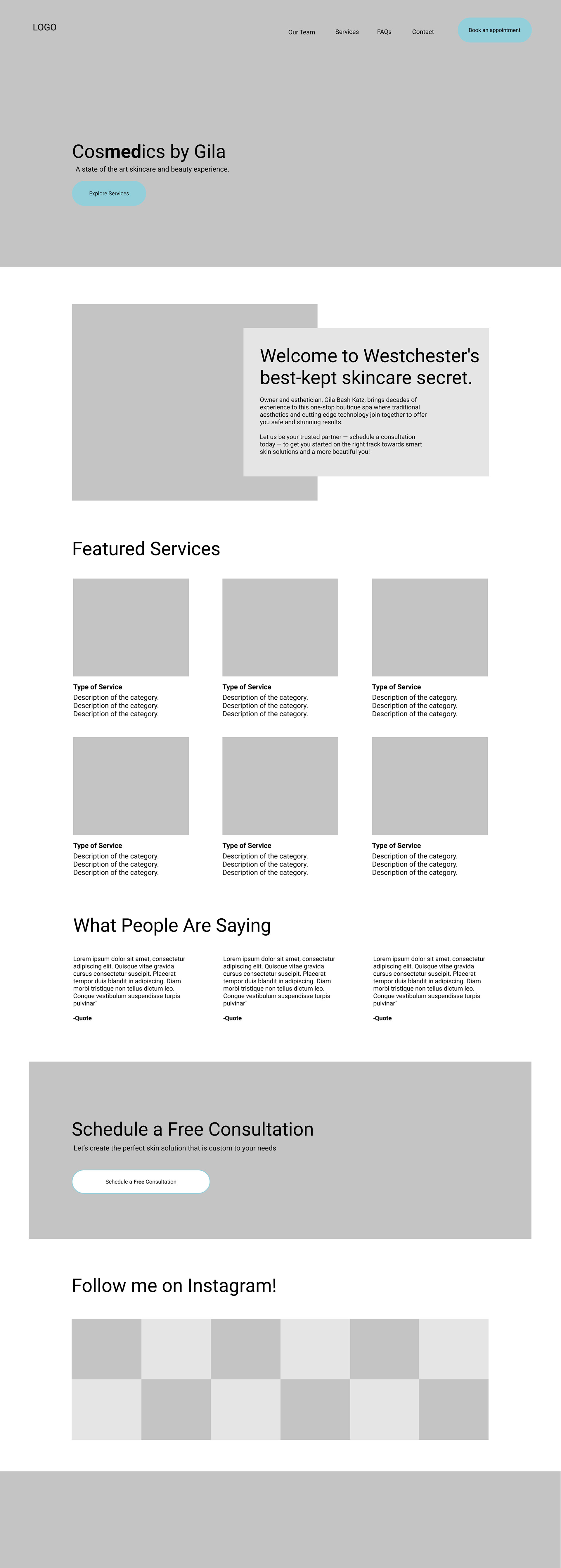
Next, I created Lo-Fidelity Responsive Wireframes. The most challenging part was framing the CTA buttons.
Gila's three main types of users who each required their own action:
1. Returning customers looking to book an appointment
2. New customers looking to explore and schedule a free consultation
3. Vendors looking to collaborate with Gila to sell their products
Additionally, Gila prefers that new clients reach her through email. She did not want to include online scheduling or make her phone number accessible. This was a challenge because users prefer to book online or via text.
I brainstormed with Gila on ways we could accommodate both her users' and her business's needs. We decided to frame the CTA buttons around getting in touch with Gila via Typeform. This platform is user-friendly and also links to email. Everybody was happy :)


Branding & UI Design was fun. I worked to maintain Gila's tone: a clean and calm approach to skincare.
I created a mood board on Pinterest for some design inspiration:
I made minor changes to Gila's preexisting logo to improve the accessibility.
Gila preferred to maintain her logo along with the exact shade of her aqua brand color. My changes involved thickening the lines and changing the font.
A Style Tile & UI Kit ensured that branding remained consistent.
I referred to Gila's Instagram platform to inform the aqua and pink color scheme.
Although the bright pink on her Instagram is fun, I chose to emphasize the softer shade of pink on her website. This gave a more high-end and professional feel.
Before proceeding, I met with Gila to finalize the content for the website.
Together, we collaborated on:
1. Photograph selections (using Adobe Stock photo folders).
2. The general content and information for the site, such as:
*specific wording for services
*headers
*footers
*Gila's personal bio (using a shared file on google docs).
Approaching Hi-Fidelity frames, I worked with Gila to accommodate both user and business goals.
Sometimes, they clashed.
Below are two examples of challenges that arose and how we worked to solve them:
1. Size of the Logo
Challenge:
The client requested that we make the logo large so that users can identify her brand.
I wanted Gila to feel happy with her product, but I am also aware that research indicates that users prefer logos within a certain size parameter. This is often different from the client's preference.
Solution:
A conversation with Gila that included:
* discussing data-driven results that state that smaller logos are better received by users
* looking at a few other high-end competitor sites. These sites display logos within appropriate size parameters
* an explanation of the technical constraints that templates place on logo size
In the end, the client agreed to make the logo 100x100 px, which is the largest of the accepted logo standard sizes
2. Color Accessibility
Challenge:
Due to the color of my client’s previous logo, color accessibility on the website grew into a challenge. How could I incorporate the existing brand colors while still maintaining accessibility?
Solution:
* Thicken the aqua blue on the logo in the header
* Use a black and white logo on the footer
* Use dark font colors on the light pink and blue consistently throughout the design
Hi-Fidelity Wireframes:
User Testing Goals:
Test if...
1. Users can navigate the site with ease.
2. The distinction between the CTA buttons is clear (new customers are able to schedule a free consultation and returning customers are able to book an appointment).
3. Users are able to identify specific services with ease.
4. Users are able to locate information on how to contact Gila.
5. Users can locate business policies, such as the cancellation policy and deposit requirement.
I built a prototype using Figma, and scheduled user testing via Zoom.
I used screen share and asked users to explain their processes as they completed the tasks. I took notes of my findings on the side.
Success patterns and areas for improvement emerged from user testing.
I organized them in this affinity map:
Check us out! https://cosmedicsbygila.com/


