Slidespace
Performance Reports for the educational technology start-up, based in Chatswood, New South Wales.
What is Slidespace?
Slidespace.ai is an educational technology tool under the company Canopy Study.
The ed-tech tool uses artificial intelligence to create study materials for students from uploaded content and materials.
PROBLEM
Teachers have limited means to analyze student performance and progress on study materials.
SOLUTION
A comprehensive 'Report View' that informs teachers of the whole class and individual student trends.
This feature will help teachers inform future instruction and track student progress.
Project
Design Reports
Team: 3
Tools
Figma
Google Forms
My Roles/Deliverables
UX Design
UX Research
UI Design
Information Architecture
Interaction Design
User Testing
My Design Process:
Empathize ⇒ Strategize ⇒ Design ⇒ Test ⇒ Ship
I created a detailed research plan before beginning the research phase.
Some of my Research Goals:
1. Discover the specific benefits of Student Reports to teachers.
2. Understand how student reports can become a part of a real and healthy classroom routine.
3. Discover the information teachers are looking to access in student reports, and understand why.
4. Identify the most common design patterns to organize reports on competitor sites.
5. Explore educational technology “quiz” and "study materials" market trends.
A thorough competitive analysis uncovered patterns that are often included in student reports.
The three most common patterns included in student reports are:
1. Student and whole class average Score %
2. Date of completion
3. Search Filters (A-Z, modules, due dates, etc.)
To learn more about teacher motivations, I surveyed several teachers.
Top Survey Findings:
*88.9% of teachers look for student and whole-class areas of needs improvement and strengths
*Teachers generally find it challenging to monitor and manage student progress and learning trends, often due to a lack of time/resources to analyze the data.
*77.8% of teachers prefer to assess student learning with quizzes
HMW Statements helped me consolidate my findings from the research and determine which user needs the reports address:
For example:
Stakeholder Collaboration
It is important to note that each stage of my design process was completed in conjunction with an awesome team at Canopy Study.
Together, we collaborated on each decision, timeline, brainstorming, and iteration. We met remotely approximately 1-2 times per week.
I took a look at the existing information architecture.
Understanding the existing structure helped me strategize the proper place to include the reports.
I discovered that currently, teachers can create study materials for students on Slidespace within this structure:
Compiling insights I gained from the research, I crafted a list of key features that would benefit the users to include in the reports.
Teachers prefer to view both individual student and whole-class trends. So, I created a basic map for the reports:
Then, I extended the map to include the relevant features for each section.
For example, this is the map that highlights the key features for the Whole Class > Subject View:
Task and user flows helped determine if users could easily achieve their goals.
Then, I began brainstorming and sketching. First by hand, then Figma.
This is one of many initial sketches. I like to flesh out initial ideas using pen and paper because it helps me explore ideas quickly.
This is one of the first initial wireframes created on Figma of the general structure of the reports.
Lo-fidelity wireframes:
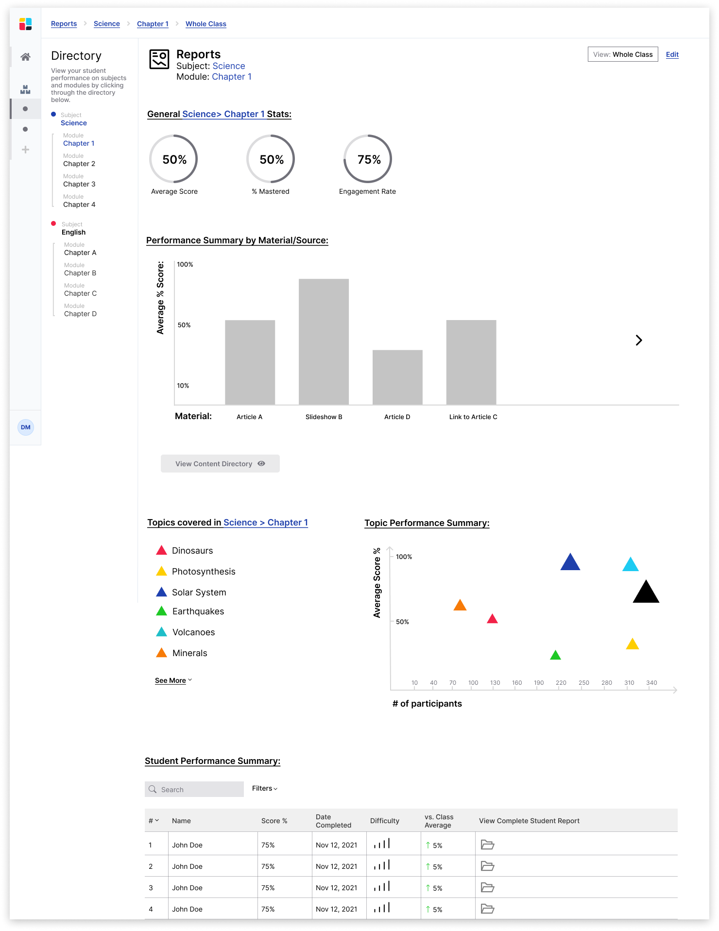
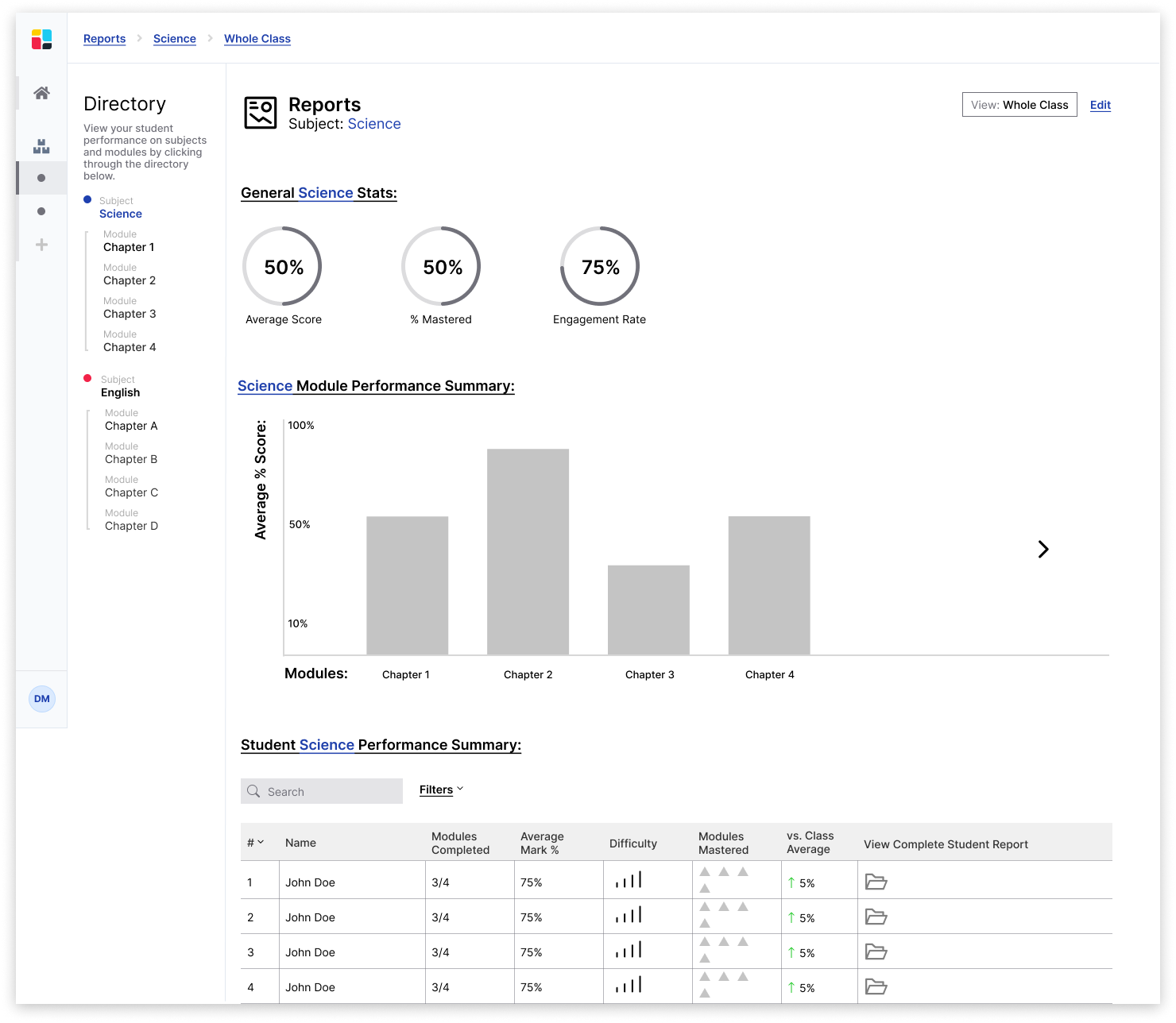
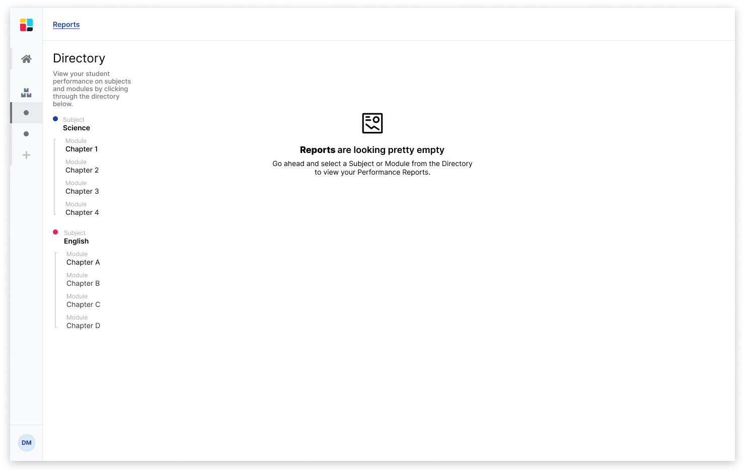
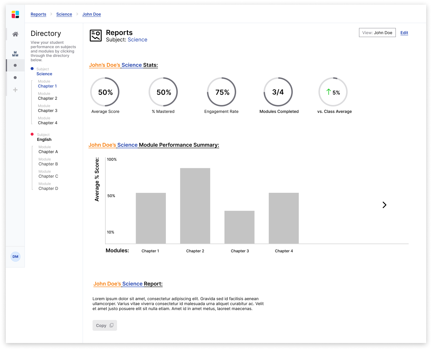
I used Slidespace’s pre-existing basic design system to inform colors, typography, button sizes, etc.
A very basic break down of the existing design system
Hi-Fidelity Wireframes:
Reports > Subject > Whole Class View
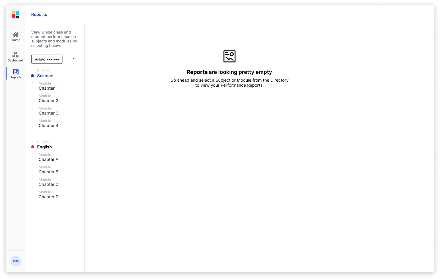
Initial landing page when the user clicks on Reports, but has not yet selected a subject or module to view
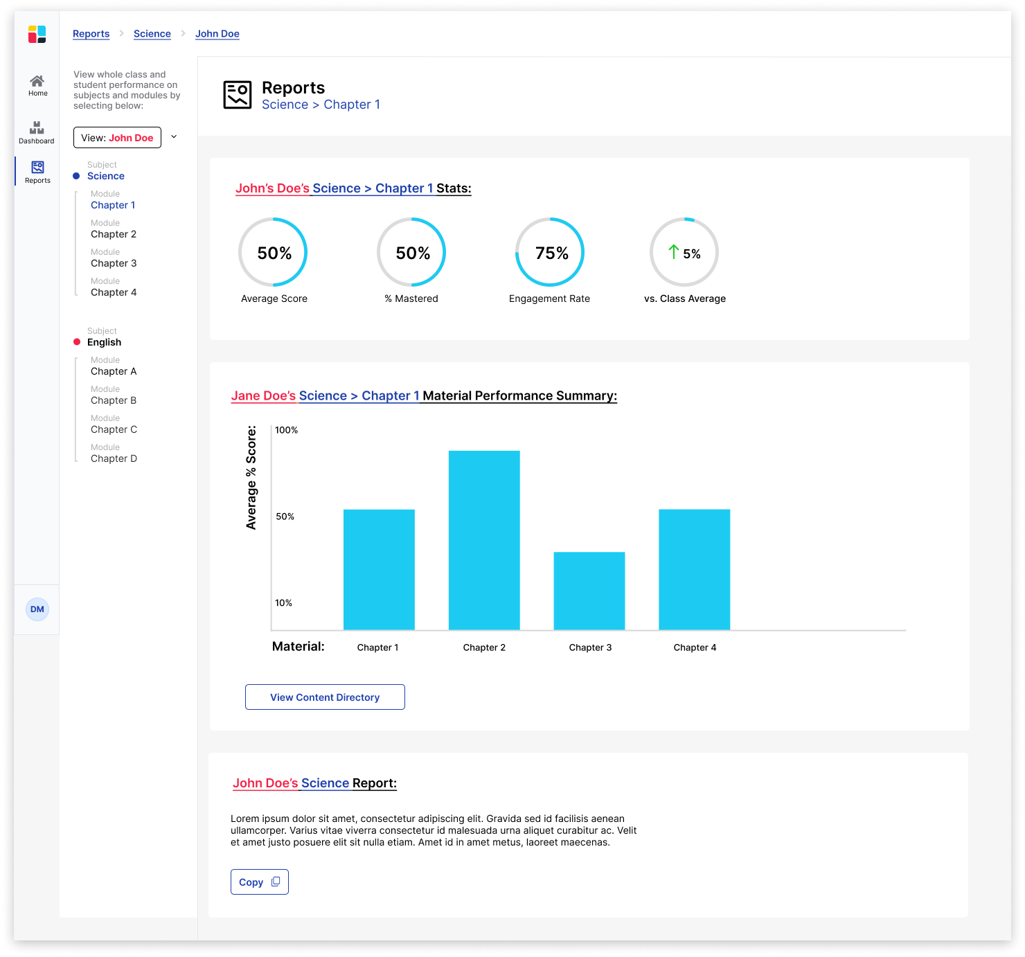
Reports > Subject > Specific Student View
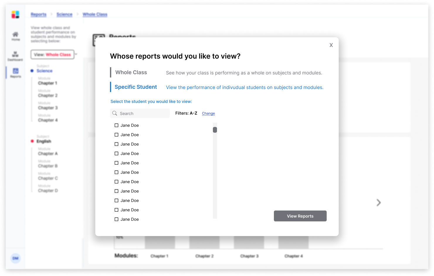
Pop-up window to switch between "Whole Class" and "Specific Student" View.
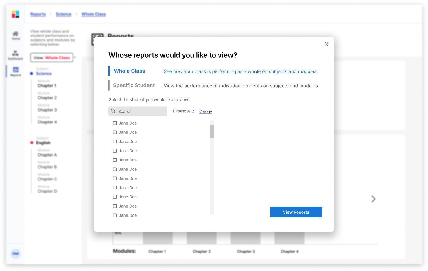
Pop-up window to switch between "Whole Class" and "Specific Student" View.
User Testing Goals:
Teacher Portal:
Test if teachers can...
1. Easily toggle between student, whole class, subject, and module views
2. Understand student and whole-class data
3. Filter through Student Performance Summary chart
To user test, I created a prototype.
The results uncovered interesting points for iterations to improve usability.
See below for two examples: ⬇
Problem A:
(See Version 1)
Some background: Teachers would toggle between viewing the "whole class" reports and "individual student" reports by clicking "Edit" on the top right corner of the reports.
Meanwhile, teachers would toggle between "subjects" and "modules" to view the reports in the "Directory" on the left-hand side.
The problem: When asked to switch the view from "whole class" to "individual student" users intuitively searched the directory on the left-hand side.
Solution A:
(See Version 2)
Move the option to toggle between "whole class" and "individual student" to the directory on the left-hand side. This way, the location of all report settings live in the same, consistent place.
Problem B:
(See version 2)
The problem: The title "Directory" and the title "Reports" were competing with each other. The visual hierarchy placed too much weight on both of these titles.
Solution B:
(See version 3)
The solution: Remove the title "Reports" and keep the instructions at the top, so the visual hierarchy is intuitive to the user.
I collaborated with an 🙌 AWESOME 🙌 team who worked on developing and co-designing the reports.
Stay tuned - the product is set to launch soon!
Moving forward...
Some UX goals for future releases:
1. Usability Testing
Spend more time testing the reports on teachers who use Slidespace in their classrooms.
2. Data collection and iterations
After teachers have implemented this product into their classrooms, I would love to conduct further research and interviews to understand if teachers feel their needs have been met and where the reports can improve.
3. Add personalization
Although the artificial intelligence generation of reports is awesome, teachers have expressed a desire to have the ability to customize reports. It would be great to explore an "edit" option for teachers to manipulate reports if deemed necessary.
4. Branding updates
There have been significant updates to Slidespace's branding since the creation of these reports. Thus, it is crucial that the reports are updated to reflect these changes.

