Sweatpants
End-end mobile application for community building during quarantine
I designed Sweatpants: an app that provides community and helpful resources to all those quarantining at home due to Covid-19.
The aim of this design challenge was to create an end-to-end mobile application.
PROBLEM
People in quarantine lack community and helpful resources.
They are looking for support during this challenging time.
SOLUTION
An app for quarantiners to gain a support system and connect with others.
So, I designed Sweatpants: a reliable resource and thriving community.
Some features of the app include:
*A community (“CovUnity”) feed where users share their experiences in quarantine with others.
*Daily goal setting
*Motivational content
*A quarantine countdown
*Local and reliable Covid-19 updates
Project:
Create an end-to-end application
Tools:
Figma
Maze
My Roles/Deliverables:
UX Design
UX Research
UI Design
Branding & Logo Design
Information Architecture
Interaction Design
User Testing
Prototype:
My Design Process:
Empathize ⇒ Strategize ⇒ Design ⇒ Test
First, I developed a Research Plan and Goals.
My top 3 research goals:
1. What are users’ greatest needs during quarantine?
2. What do users most enjoy about being in quarantine?
3. What kind of technological support/apps already exists for users in quarantine?
To learn more about my research goals, methodologies, assumptions, participants, and timeline, read my complete Research Plan.
Secondary Research/ Competitive Analysis uncovered some fascinating insights:
My assumption before research: An app that provides BOTH Community (🤝) and Resources (⚙️) for people in quarantine MUST be out there.
My discovery after research: I was totally wrong. No such app exists!
But, I did find some cool indirect competitors:
To learn more, I interviewed and surveyed 25 candidates who have been quarantined before.
The ideas I discovered were really interesting and helped me develop a hierarchy of features to include in the app.
Some users indicated that they enjoy the slower pace of quarantine. Others yearned for action.
The user personas I created represent many personalities identified through my research.
Taking all of my user research into account, I gained a deeper understanding of user goals and needs.
These insights helped me create design solutions tailored to quarantiners.
Using my own unique process, I developed Project Goals and a Product RoadMap.
This way, I created a strong list of key features for the app:
For this project, I decided to focus on designing the following features for the app:
1. Quarantine Dashboard: A dashboard for quarantiners to access supportive resources (⚙️)
Includes:
-Quarantine Countdown
-Inspirational Quotes/Jokes
-Goal Setting
-Journaling
2. CovUnity Feed: A news feed where users can establish a sense of community (🤝) with other quarantiners.
Includes:
-Ability to post updates, tips, feelings, etc. about life in quarantine
-filter through posts
To see the rationale behind all of the features, see my complete Product RoadMap.
I created a SiteMap to organize the Information Architecture:
To validate my SiteMap, I did a Card Sort with a few participants from my research cohort.
I focused on organizing the following categories:
1. Community 🤝
2. Quarantine Resources ⚙️
3. User Profile👤
Users demonstrated a deep-rooted need to feel part of a larger resourceful community (🤝⚙️).
Task and user flows determined avenues to address this goal.
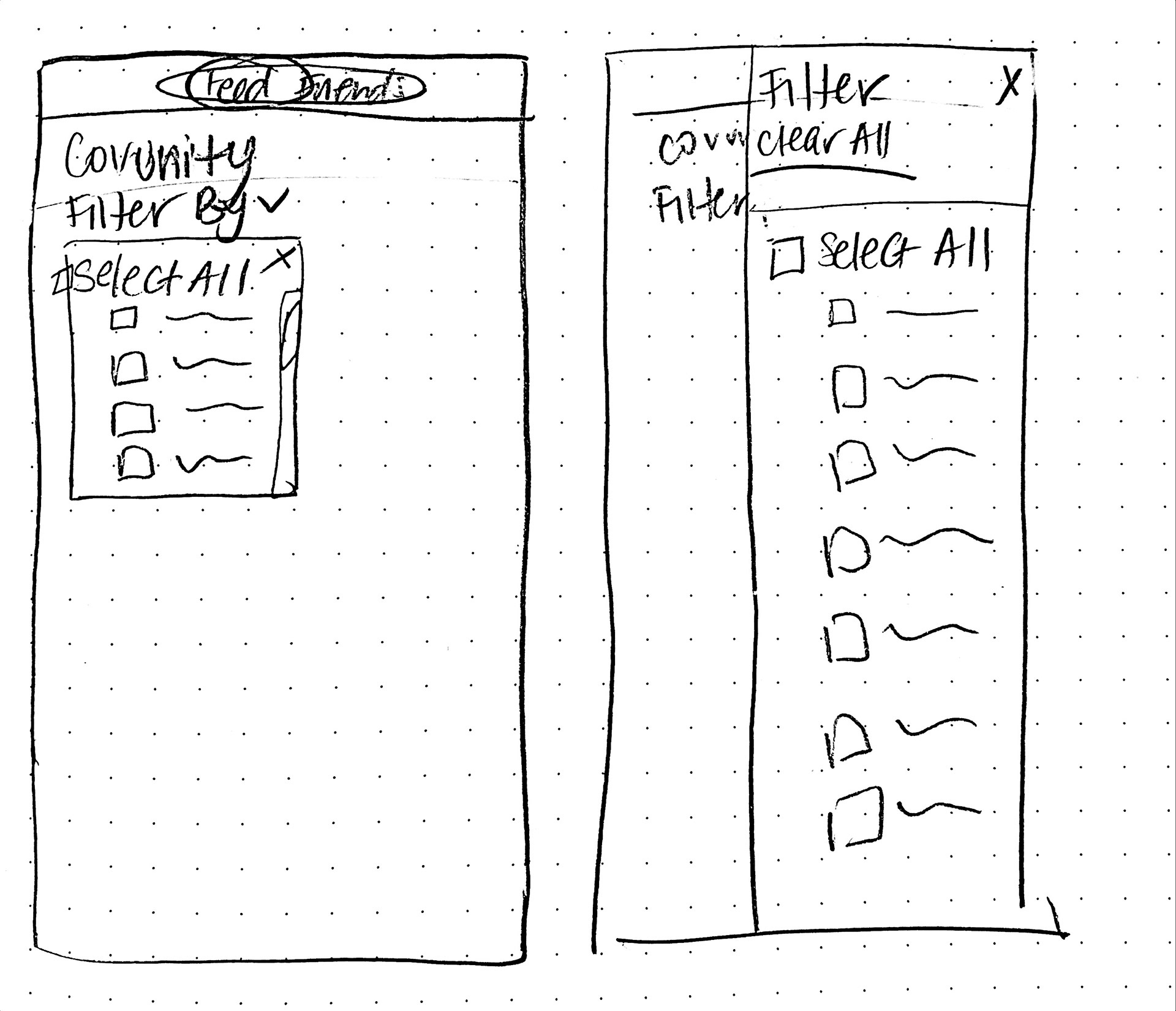
For example, Ryan is the kind of guy who likes the outdoors and spends less time online. I designed a filter feature so it would be easy for him to find fitness programs to do at home:
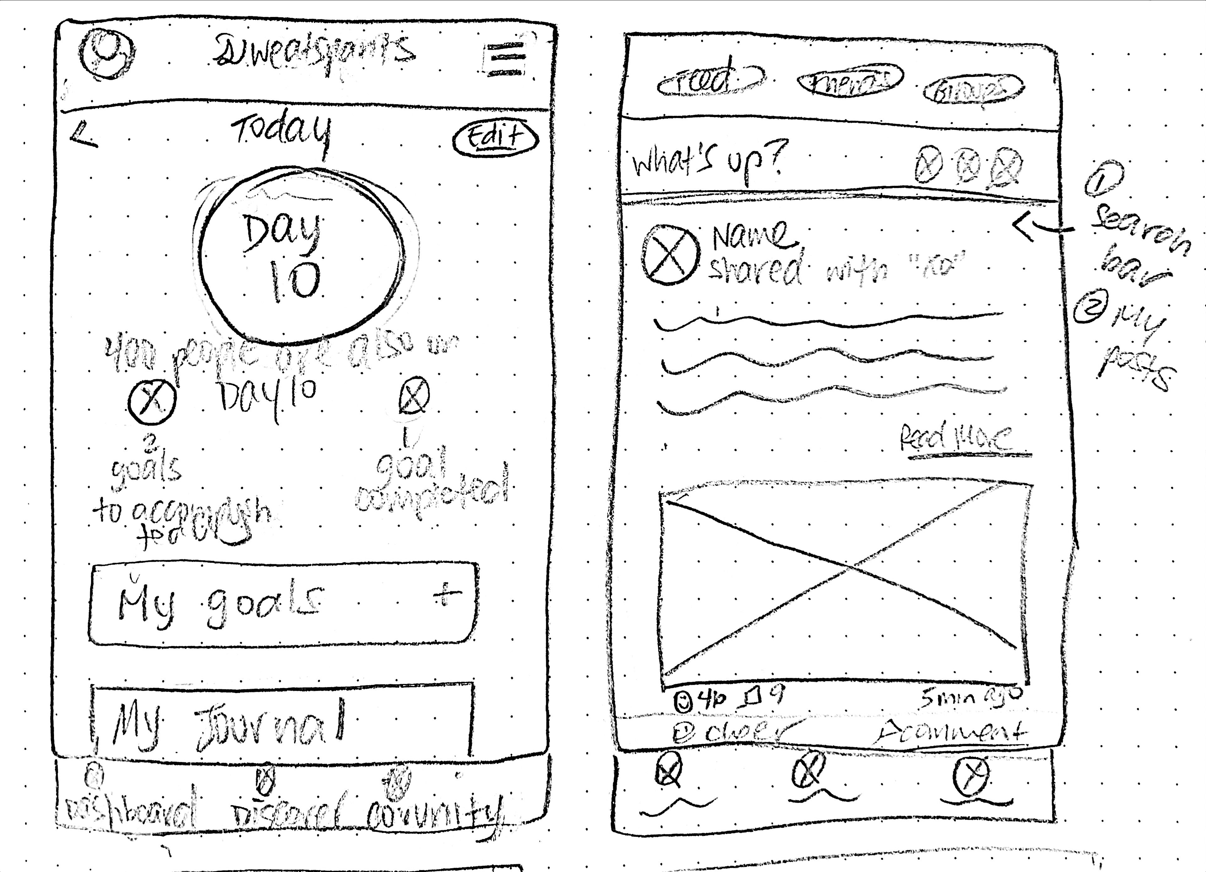
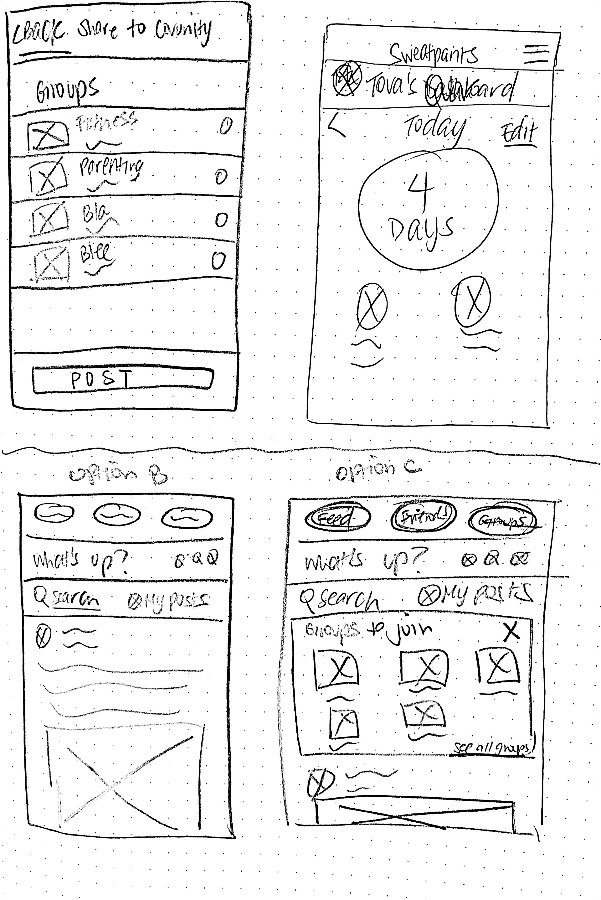
Sketching my ideas with pen and paper helped me explore many options in a short amount of time.
I like to take this time to brainstorm before moving on to Figma:


Next, I created Lo-Fidelity Wireframes:
During User Testing, I uncovered two main pain points that informed my first iterations:
Some Context on the "Create a New Post" Feature:
Users can "Create a New Post" on the quarantine feed to share their experience in quarantine with others. This helps establish community 🤝.
PAIN POINT #1:
Users needed a more straightforward way to "Create a New Post" from any page on the app.
MY SOLUTION:
Add a "+" icon to "Create a New Post" on the bottom navbar.
Some Context on the "Filter" Feature:
Users can use "Filters" to sift through the Quarantine Feed. This enables users to access content that meets their interests (⚙️).
Users had trouble with the filter touch points.
MY SOLUTION:
Change the design of the filter feature. Instead of pills, the filter will slide in. Users can refer back to the filter page at all times.
Logo & Branding:
A) Key Words
I brainstormed 5 keywords to drive design decisions for the brand →
B) The Name
User research indicated that many people have enjoyed the "excuse to wear pajamas" during quarantine.
And so, the name Sweatpants came to be!
C) Colors:
I looked for warm and vibrant images that would be fun to take inside.
I came across this poster, and it was the perfect fit 👇
I brightened up the colors for a more fun and vibrant feel. I used the original shade of light green (C) for accessibility.
D) Logo & Style Tile
Hi-Fidelity Frames:
Scrolling through the Sweatpants Dashboard
Creating a New Post and selecting the "Food & Cooking" tab
Selecting the "TV & Entertainment" filter to scroll through the CovUnity feed
I sent a prototype to conduct Usability Testing to six participants.
The users fell into my prime age demographic: 20-35
User Testing Goals:
Test if users can….
1. Post a new post and set a tag for it
2. Locate the CovUnity feed
3. Share a post with a friend
4. Identify the number of goals they have completed in a day
5. Select specific filters (TV & Entertainment) to scroll through their feed
User Testing Results:
100% of the users were able to complete the tasks.
After compiling my results, I established several key takeaways from this project.
The following list identifies some of my learnings from the design process. It includes ideas for future iterations and remaining concerns to be mindful of:
1. Content creation
After the app kicks off, Sweatpants can begin to create their own content (such as fitness, cooking, health, etc.)
2. Broader usability testing
I focused on the age demographic 20-35 (the prime audience of Sweatpants). I would like to test a broader age group in the future for more informative data that can allow the app to appeal to a broader group.
3. Additional features
Some additional features that can be added:
1. Quarantiners can review their experience ordering from specific delivery locations
2. An option for non-quarantined household members to download the app as well. They can receive content that will help them support the quarantine.
4. Technical Feasibility
Given that this is solely a design project, it is critical to be aware that the potential development process may provide technical constraints. These may present as major blockers or design trade-offs.


